How to Color Grade Like Netflix in Wednesday Season 2
Achieve the Moody, Cinematic Look of “Wednesday Netflix” at Home
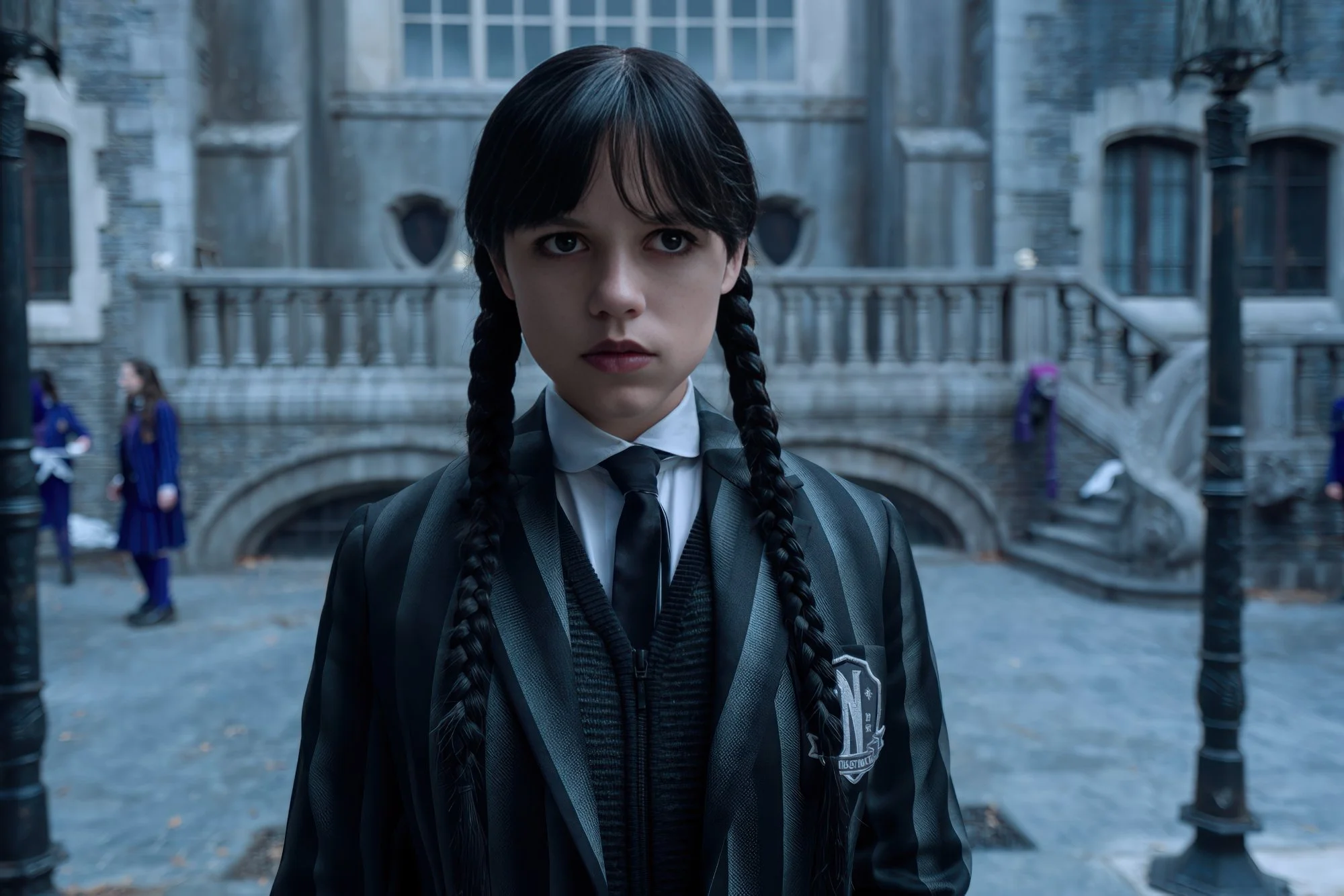
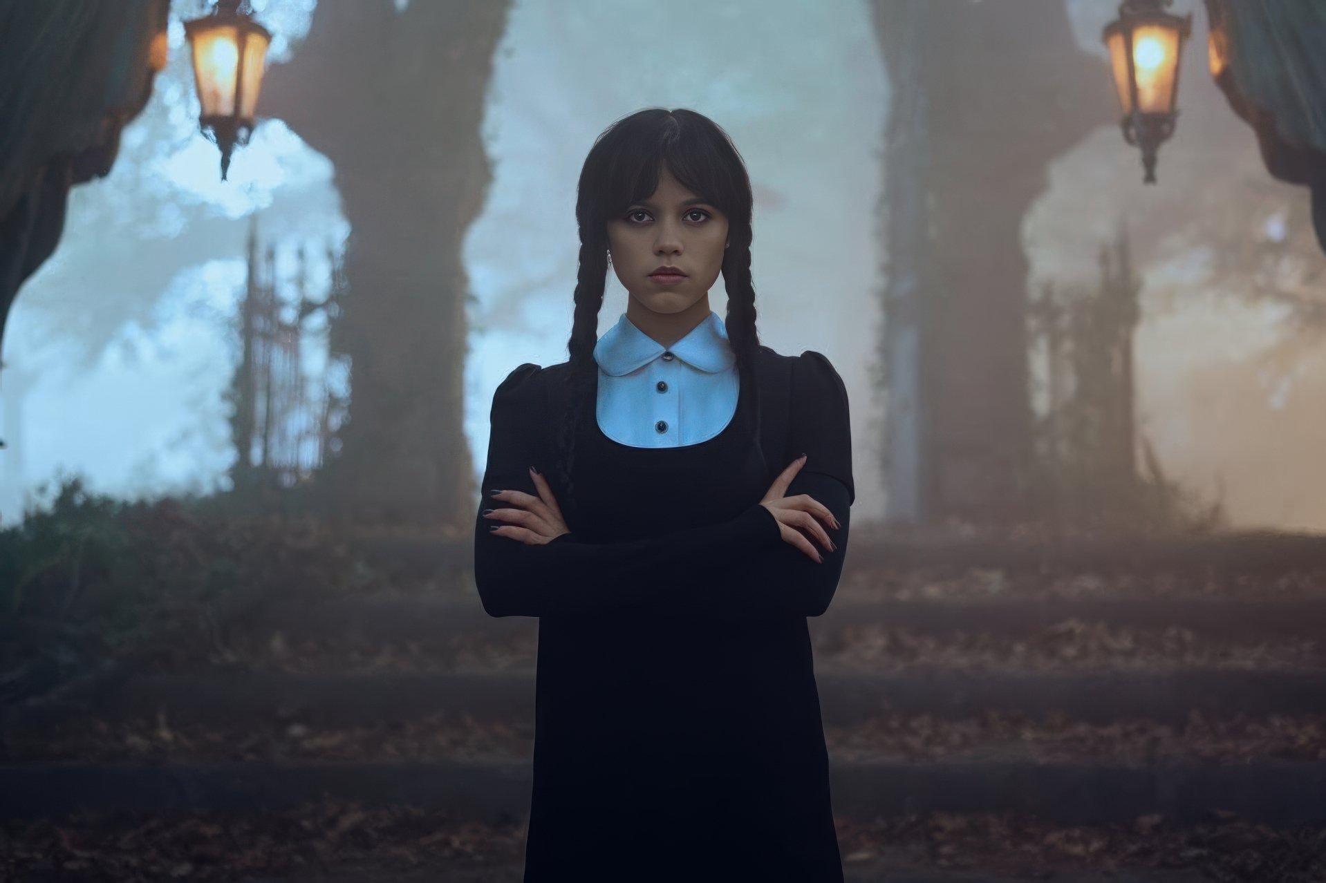
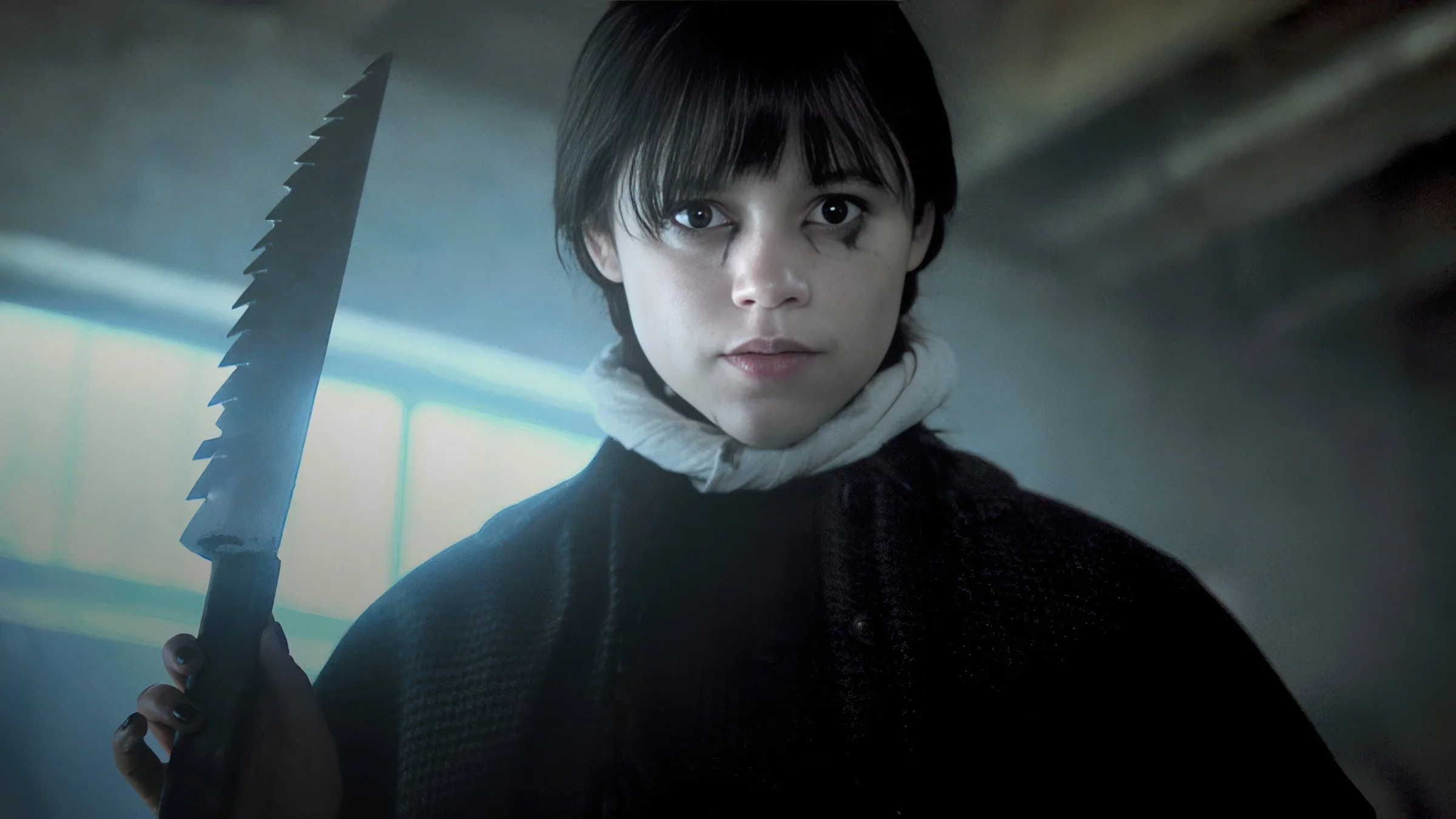
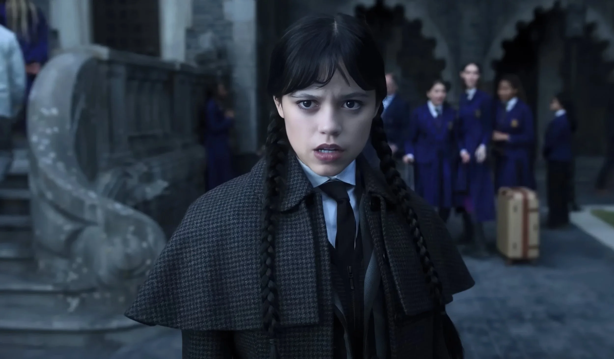
If you’ve seen Wednesday Season 2 on Netflix, you already know — the look is striking. It’s gothic, cinematic, painterly, and modern all at once. Whether you’re shooting a short film, a YouTube series, or just leveling up your reel, this post will break down exactly how the Wednesday Netflix color grade was created — and how you can mimic it at home, even with a mirrorless interchangeable-lens camera and basic editing tools.
Let’s dive into the shadows.
What Makes Wednesday Look So Distinct?
The visual style of Wednesday Season 2 leans hard into its gothic atmosphere. The cinematography is already beautifully lit, but it’s the color grade that gives it that haunting polish. Some key visual traits:
Muted color palette (especially greens and reds)
Deep shadows with soft roll-off (not crushed)
Skin tones that feel neutral, pale, and cold
Cool shadows and warm highlights for contrast
Minimal saturation but selective color pop
A fine layer of grain and bloom to add texture
This isn’t a high-contrast blockbuster look. It’s moody without being muddy, stylized without looking fake, and filmic without overprocessing.
How to Color Grade Like Netflix in Season 2: The Basics
You don’t need a Netflix budget to pull this off. Here's a DIY workflow using DaVinci Resolve, Final Cut Pro, or Adobe Premiere.
1. Shoot in Log or Flat Profile
If you’re using a mirrorless interchangeable-lens camera, like a Sony a1 like me or a Sony a7 series, Canon R-series, Fuji X, or Lumix S5 — make sure you shoot in log (S-Log, C-Log, F-Log, etc.) or at least a neutral flat profile. This gives you the dynamic range needed for post.
Pro tip: Use a grey card and expose skin around 40–45% IRE in log for that Wednesday skin tone base.
2. Apply a Base Correction
Before diving into style:
Normalize exposure
Set contrast gently
Adjust white balance
Add a slight contrast pivot (lift shadows, lower mids slightly)
This step makes your footage neutral, clean, and ready for creative work.
3. Build the “Wednesday Netflix” Look
Here’s how to build the look node-by-node (or layer-by-layer if you're not in Resolve):
🧪 Shadow Tint:
Add cool tones to shadows — think teal, cyan, or steel blue. Avoid green.
🧪 Midtone Neutral:
Desaturate mids slightly. Keep skin cool and pale. Use qualifiers or masks if needed to isolate skin tones.
🧪 Highlight Warmth:
Let warm light peek into highlights — candlelight, window spill, overhead bulbs. This subtle contrast sells the vintage gothic vibe.
🧪 Desaturation:
Global saturation down to ~80%. Then use Hue vs Sat curves to pull down greens, reds, and yellows — except when key colors are part of the story (like blood or wardrobe details).
🧪 Glow & Bloom:
Light bloom adds that dreamy softness to practical lights or backlit scenes. Use OpenFX glow in Resolve or Lumetri’s Gaussian blur + blend mode in Premiere.
🧪 Grain:
Add a 16mm or 35mm film grain overlay. This isn’t a YouTube vlog — the texture makes it feel expensive. Light grain only — don’t overdo it.
Software-Specific Tips
In DaVinci Resolve:
Use Log Wheels to control shadows/mids/highs
Try FilmConvert or Dehancer for realistic grain and halation
Use Power Windows to isolate lighting or mimic vignettes
In Final Cut Pro:
Use Color Wheels and Hue/Sat Curves
Combine LUTs with custom shadow tint layers
Use plugins like mLUT, Coremelt, or Color Finale Pro for more control
In Premiere Pro:
Use Lumetri’s Color Wheels and Curves panel
Add glow by duplicating layer → blur → “screen” blend
Use LUTs for base look, then tweak with selective HSL
Downloadable LUTs?
If you’re looking for a shortcut, there are LUTs out there inspired by the show. Just search for:
“Wednesday Season 2 LUT”
“Gothic Film LUT”
Or build your own using the color breakdown above
Apply your LUT to a neutral image, then fine-tune from there. LUTs are just a starting point — never the final touch.
Final Thoughts
The reason Wednesday Netflix looks so good isn’t just the cameras or budget. It’s a result of deliberate, restrained color design — and you can absolutely replicate it yourself with time and patience.
Even with a mirrorless interchangeable-lens camera, the right lighting, exposure, and color work can give you that high-end gothic film vibe. So go shoot something weird. Make it moody. And let your shadows speak.
Want to Make Your Own Wednesday LUT?
Follow These Steps Below for Final Cut Pro
You don’t need a Netflix budget or a Hollywood colorist to get the Wednesday Season 2 look. If you're editing in Final Cut Pro and shooting with a mirrorless interchangeable-lens camera, here’s how to build your own cinematic Wednesday Netflix-style color grade from scratch — and even turn it into a reusable LUT.
🎬 STEP 1: Prep Your Timeline
Drop your log or flat-profile footage into the timeline.
Add a free Adjustment Layer above your clip (download if you don’t already have one installed). This lets you apply your color grade non-destructively.
🎨 STEP 2: Create the Wednesday Look
In Final Cut’s Color Inspector, use the Color Wheels:
Exposure
Shadows: –10
Midtones: –5
Highlights: +2
Saturation
Global: –15 to –20
Shadows: –10
Highlights: +5 (optional warmth)
Color Tinting (Color Wheels)
Shadows: slight blue/teal shift
Midtones: lean toward neutral gray-blue
Highlights: tiny push toward warm yellow-orange
This builds that classic cold-shadow/warm-highlight separation that defines the Wednesday Netflix vibe.
🎛 STEP 3: Refine With Curves
Color Curves
Pull shadows down for mood
Slight lift in upper mids for rolloff
Optional S-curve for softness
Hue vs Saturation
Red: –30 (unless blood or makeup is story-critical)
Green: –20 (to kill that fresh-green modern digital look)
Blue: +5 (to preserve that cool gothic edge)
Hue vs Hue
Nudge green → cyan
Nudge red → rust/brown
✨ STEP 4: Add Bloom + Grain (Optional Plugins)
Use tools like Color Finale, mLut, or Dehancer for professional glow and texture.
Add a light bloom to windows or candles
Apply subtle 16mm/35mm film grain for that cinematic finish
No plugins? No problem. Use:
A blurred duplicate clip set to screen for soft glow
Free film grain overlays (set to overlay blend mode)
💾 STEP 5: Save It as a Preset
Once it looks right:
Right-click your Adjustment Layer
Choose Save Effects Preset
Name it something like:
Wednesday_Season2_LookApply it to any future clip in one click
🔁 BONUS: Export Your Grade as a .CUBE LUT
If you want to export this as a true LUT you can use in other software (DaVinci, Premiere, etc.):
Option A: Use Color Finale Pro
Grade inside the plugin
Export your LUT directly as
.cube
Option B: Use LUT Generator (Free Tool)
Download a neutral color chart PNG (from LUT Generator site)
Drop it in Final Cut and apply your Wednesday look
Export the graded chart PNG
Upload both to LUT Generator → Export
.cube
Based in Pittsburgh and need product, food, or brand photography? I’m Ian Jones, a commercial photographer serving Pittsburgh and Western PA. Come check out my work! or follow me on Instagram